User Testing
With the goal to understand how well the created set of map animations achieve their goal as cartographic products, a survey was conducted to gather as many opinions as possible. The online platform JotForm was used to build a questionnaire in which the participants were first asked on their opinion of the animations and after that were requested to find answers to questions about the visualized information.The questions of the survey were designed to cover numerous aspects that are relevant in the assessment of map animations.
Survey setup
The participants were asked to watch one animation at a time and subsequently to evaluate the just seen video by choosing how much they agree or disagree with a series of statements. The seven given statements were:- There are sufficient elements of supporting information to understand the animation.
- The animation achieves to convey valuable information.
- The animation has an appealing visual aesthetic.
- Important animation elements and text elements are legible.
- The visual load of the animation is appropriate.
- Visual effects and elements do not distract from important information in the animation.
- All important map elements are listed in the map legend (or if no legend was included in the map: The animation works well without a map legend)
Survey results
Using an online survey with questions and tasks for each of the map animations, a good picture of the respective strengths and weaknesses of the animations could be determined. The overview of the feedback shows that the reactions about the animations were largely positive. The informativeness of the animations, the compliance with cartographic principles as well as the general visual impression were well received by the respondents. One of the main criticisms was the inadequate legibility and recognizability of different elements and texts. According to later analyses, this was due to, on the one hand, too small font sizes and map elements, such as the individual ships. On the other hand, the speed of the animation videos was seen as too fast by the viewers and caused difficulties to understand and interpret the visualized data.

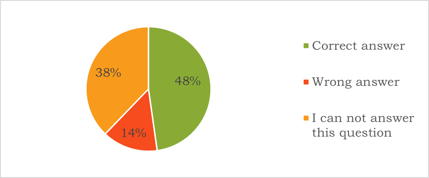
In addition to these subjective assessments of the respondents, the participants were also asked to solve some tasks, the answers of which could be found by extracting information from the animations.In total, only 48% of the answers were given correctly. However, it should also be noted that only 14% of the answers were wrong and the remaining 38% were classified as unanswerable questions by the participants. It can be concluded from this distribution of answers that at their core the animation videos were correct and did mostly not lead to misunderstandings. This is because the share of submissions that declared not to be able to solve the task is high, but the rate of wrong given answers is low. The animations are provided with too little explanatory information and at the same time too many distracting effects and elements, so that the core information of the animations is not clear in some cases. Improvements like the incorporation of scalebars for more spatial context as well as the enlargement and slowing down of the individually moving ships could help to achieve a higher rate of correct answers. The results of this part of the survey show the need for improvement in communicating the important aspects of the map animations. It clearly shows the necessary balancing act between clearly communicated information and inviting and enjoyable visualizations.