Map Animation of Shipping Traffic in Adobe After Effects from GIS data
Author: Nelson SCHÄFER
Supervisor: Prof. Dr. Vít VOŽENÍLEK
Co-supervisor: Assoc. Prof. Dr. Barbara HOFER
OBJECTIVES
The aim of this thesis is to present the motion graphics software Adobe After Effects as a tool for creating animated visualizations of GIS data. The main part of the content deals with the practical creation of map animations based on spatial datasets from the topic of shipping traffic. A set of five created map animations is introduced, and the used workflow to create these animations is explained in detail. The essential steps of the transfer of geodata from ArcGIS Pro to Adobe After Effects are described and important findings are shared. Then, in the theoretical part of the work, the quality and informative value of the created animations are assessed on the basis of a survey and personal findings. Finally, an evaluation is given, which assesses Adobe After Effects as a tool to visualize spatial data and shows strengths and limitations based on the gained experiences.
METHODOLOGY
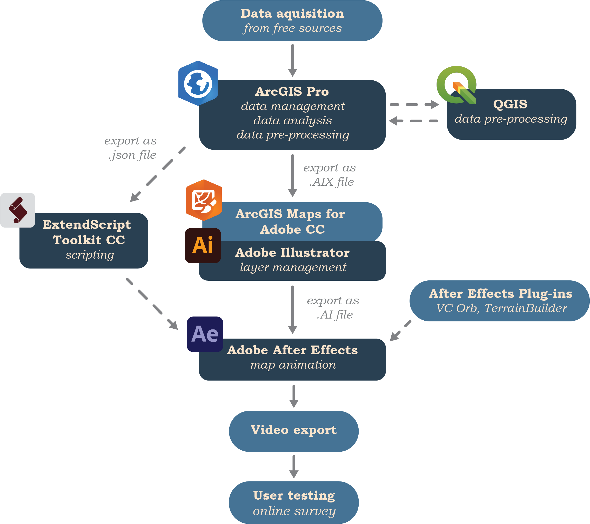
Before the practical implementation of the animation could begin, a considerable amount of research on literature, instructions and tutorials had to be made. Adobe After Effects is a very complex and versatile software that takes time to learn and understand. In order to get familiar with types, approaches and visual styles of map animations and particularly shipping traffic animations, examples were searched online and analysed. Based on this knowledge, the set of available tools in Adobe After Effects was explored. Functionalities that looked promising to be implemented in the process of creating map animations were documented and practiced. Especially extensive tutorial video series on the YouTube platform helped to learn to apply advanced techniques in the After Effects software. The acquisition of data was conducted online via geoportals and search engines and led to a collection of potentially relevant datasets that were managed and analysed in ArcGIS Pro. Here, and occasionally in QGIS, the processing included calculations of statistics, spatial analysis or filtering of the data. Afterwards, a map composition with a proper symbology was created and exported as AIX file format. This data type is used to transfer map layouts from ArcGIS Pro as unchanged as possible into an Adobe Illustrator project, whereby things like layer names or classifications are retained. In order to read this file type, the ArcGIS Maps for Adobe Creative Cloud plug-in must be installed in Adobe Illustrator and the document imported with it. In that way generated Illustrator projects were then prepared for the subsequent import to Adobe After Effects. In addition, the attribute table for some animations was exported from ArcGIS Pro and saved as JSON files. This was necessary because when the map layout is exported from the GIS environment, any attribute information is lost or at least not included in the exported file. Via scripting in Adobe ExtendScript Toolkit CC, the connection between the JSON table and the geometry layers was possible to be restored later in Adobe After Effects. The compilation of the compositions in Adobe After Effects included the created Adobe Illustrator files but also many other elements like images, graphics or text. Then, with the tools of the animation software, installed plug-ins and scripting commands the animation process was conducted. The finished animation compositions were then exported as high-definition videos for presentation. To evaluate the quality of animations from an audience, an online survey was prepared and filled by survey participants. Based on the results of this questionnaire, personal experience and individual feedback the quality of the animations was assessed. Additionally, conclusions about the suitability of Adobe After Effects for the creation of map animations were drawn and reported.

RESULTS
The main result of this thesis comprises a set of five map animations that visualize in different ways phenomena related to the topic of shipping traffic.To create the animations, data pre-processing methodologies of various kinds were applied in ArcGIS Pro to prepare the raw data for the further workflow. Based on a workflow published by Esri a approach was developed to transfer the desired GIS data to the animation software Adobe After Effects. In combination with a capability of Adobe After Effects, presented in one of Adobes workshop on how to create data-driven animations by using JSON files, a workflow was able to be developed to have access to GIS geometries and attributes in the animation software. By using self-developed scripts to automatically generate animation parameters from attribute values in JSON files, complex cartographic animations were created. In addition, the tools of Adobe After Effects and the capabilities of two plug-ins were used to design visually advanced cartographic compositions.
The motivation of this thesis to choose Adobe After Effects as a tool to create cartographic animations originated from the desire to extend the scope of what is possible in terms of visualizations of GIS data. Sophisticated animation capabilities were successfully used, however the exploration of potential of Adobe After Effect is far from being exhausted. More time and more experience in the software could result in more refined workflows and new ways to visualize spatial data. As described, the limitations when working with large data sets have shown that Adobe After Effects is certainly not suitable as an animation tool for every type of data set and every kind of visualization. In addition, the purpose for animations created with Adobe After Effects should not be scientific visualizations on the basis of which important decisions are made. Rather, Adobe After Effects is ideal for creating visually appealing and highly customizable animations. With the knowledge of the strengths and weaknesses of the software, unique animations can be created, which clearly stand out from the standard solutions from other animation tools. The amount of effort required to create an animation is well worth it if the purpose of the animation is to do exactly what Adobe After Effects is capable of. Taking into account the cartographic principles, which ensure that visualized spatial information is effectively and correctly presented, animations created in Adobe After Effects can reach new target groups with cartography. This is exactly what has been achieved with these animations: visually impactful animations that attract attention, that are visually enjoyable, that possibly introduce uninterested people to explore the topic.
Traffic Density of Pleasure Vessels on Lake Superior
The first created animation deals with Lake Superior and the activity of vessels of the category pleasure vessels in a period from March 2017 to December 2019. In the 35 seconds duration of the animation video, the heights of 1,371 hexagons are shifted at monthly intervals based on the recorded activity in the respective areas of the lake. From this animation, phases and areas can be recognized in which there is a particularly high level of activity and how this activity changes during the months.
Incidents of Piracy in the Indian Ocean
This animated map msi visualizing piracy incidents and similarly classified events between 1990 and 2020. On a slightly rotating globe, the incidents in the Indian Ocean and the adjacent seas are shown over time by using flashing illuminated points. During its 2:08 minute runtime, the animation video additionally shows the development of worldwide piracy events using an animated graph.
3 Days of Shipping Traffic in the Port of Piraeus
The third map animation shows the Port of Piraeus in Athens and the shipping traffic for three consecutive days in July 2015. Individually moving ships, which are coloured differently according to their vessel categories, move in a three-dimensional scene. In addition, a number of auxiliary elements improve the information content. Among other things, a dynamic change of light shows the currently displayed time of day, and an included overview map clarifies the location of the depicted area. Furthermore, the different port regions of Piraeus are shown and allow of a better interpretation of the observed ship movements.
Transits on Artctic Shipping routes in 2019
In the animation about the arctic ship routes in 2019, many different components were combined. The animation explains the relationship between the change in the expansion of the Arctic sea ice and complete traverses of the Arctic ship routes. The animation contains the changing extend of the sea ice as well as statistics on transits between the oceans on the various Arctic ship routes. The visualized content of this animation is supported by, among other things, a rich basemap and a chart of statistics from the last few years.
1 Week of Shipping Traffic in the Hawaiian Islands
For the last map animation the shipping traffic on the Hawaiian Islands was visualized. In the 90 seconds of the animation, ships are moving individually over a period of one week. In addition, this animation is characterized by the realistic landscape with three-dimensional terrain and textures from satellite images. The categories of different ship types are reflected by differently coloured vessels, and the most important ports of the regions are shown give more context about the ship routes.
Completed work for download