Introduction
Interactive web maps are those which are published and accessed over the internet. They are are composed of two main display elements;
a cartographic display area where the map itself is presented and a set of graphical user interface elements which allow for interaction with the map data.
The design choice for the inclusion and placement of the interactive elements on a web map is open, however researchers agree that a web map
should be as simple as possible, and only include the functionality that is necessary for the map purpose.
It is important to evaluate the usability of web maps especially because their design is open and poor user experience leads to reduced map use.
Usability is the extent to which a system, product or service can be used by specific users to achieve specific goals with effectiveness, efficiency,
and satisfaction in a specified use context. Usability metrics such as rate of correct answers, time taken to complete tasks and subjective opinions
can be used to evaluate the effectiveness, efficiency and satisfaction derived from a product.
The choice of a usability assessment method is dependent on the type of informaton that is required. An assessment could be formative - identifying problems, or
summative- identifying which design version is better. The assessment could either be quantitative or qualitative, or could provide objective or subjective insights.
Researchers agree that a mixed approach is ideal since usability is multifaceted, and no single method can provide information on all usability aspects.
Methodology
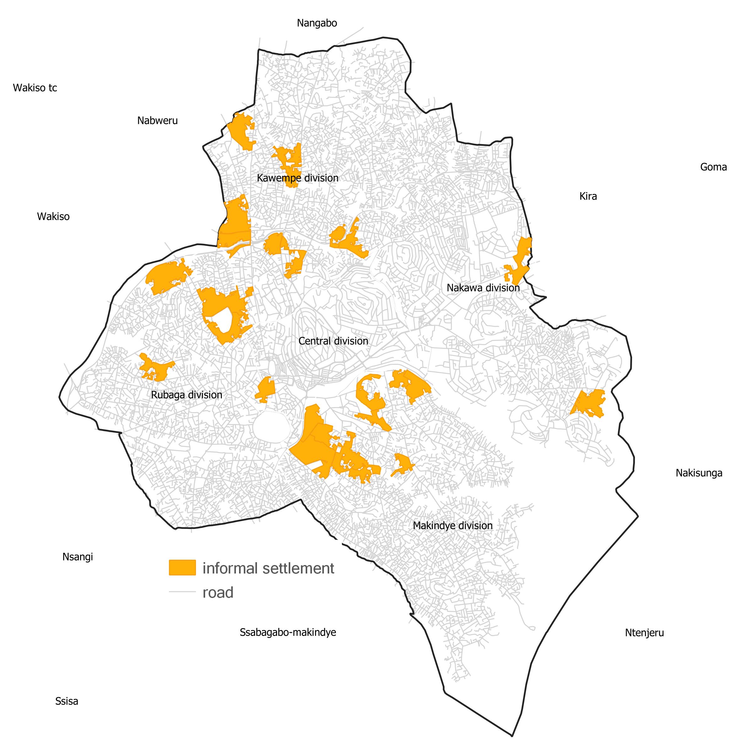
Study Area
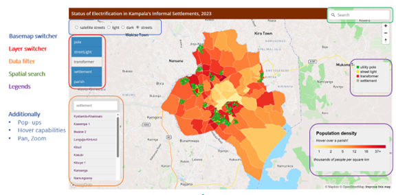
The web map was designed to show the electricity utility infrastructure mapped in 25 informal settlements in Kampala.
These settlements were selected randomly among the settlements in which the Slum Federation of Uganda has engagements.
This was done to ensure safety and a smooth process of mapping the electricity infrastructure within these settlements.
The team at Spotlight Kampala modified the spatial boundaries of the settlements beyond the official administrative boundaries.
Workflow
The overall methodology can be visualised using the flowchart shown below. To determine the content of the web map
an evaluation of the existing maps in the Uganda energy sector was performed. In addition, interviews were held with five electrical
engineers from umeme. During the interview sessions, the engineers provided insights into the design of the web map.
The web map was designed with MapBox GL JS, using data collected under the Spotlight Kampala Project.
This webmap provided the stimuli for the usability assessment.
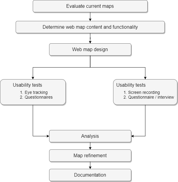
Usability assessment was performed using a mixed approach. A combination of quantitative and qualittive methods were applied
to the remote and in-person usability assessments. The usability tools employed include questionnaires, screen recording, interviews,
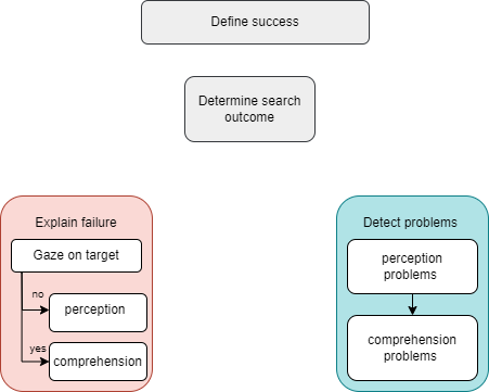
and eye-tracking. During the eye-tracking usability assessment, the target search analysis framework was used.
From the usability assessment, the effectiveness of the web map design was determined using the correctness of answers and
the satisfaction derived from the web map was determined by capturing subjective feedback.
The output of the usabilty assessment was a list of problems with the designed web map, reasons for the problems and possible solutions.
Results
The results can be divided into: results from designing the web map and results from performing a usability assessment of the web map
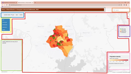
Electricity Utility Web Map
Available at the URL: https://eyetracking.upol.cz/letaru//
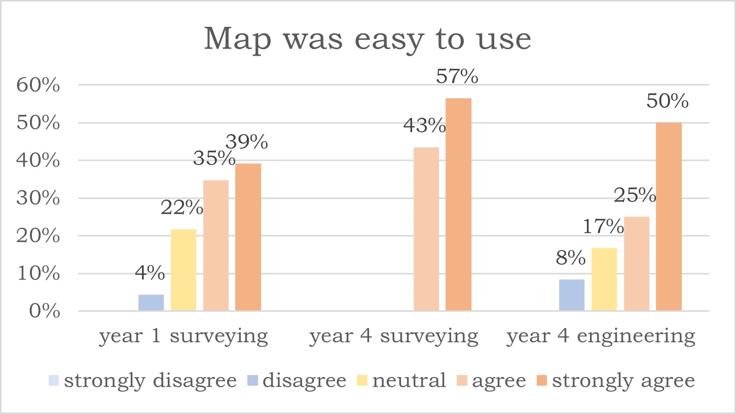
Subjective Insights from Remote Assessment
Ease of use
Suggested changes to web map
Insights from the eye-tracking experiment
Area of interest
Analysis and reporting of the findings from the eye-tracking experiment was done with relation to these AOIs
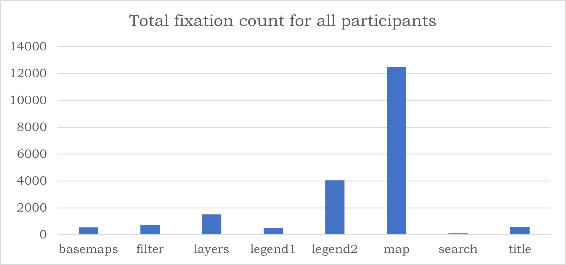
Total Fixation count
It can be noted from the total fixation count that the map had the highest number of fixation followed by legend2.
This was in line with the design strategy of the web map, where the map canvas and legends were designed to convey most of the information.
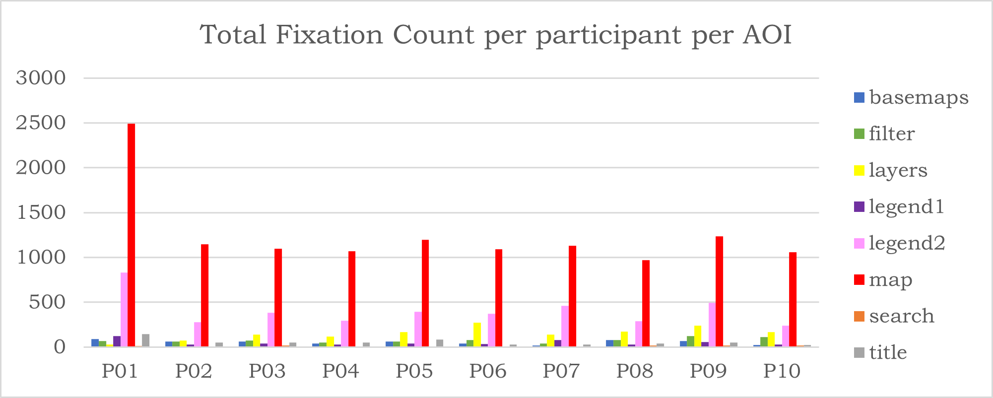
A comparison of the fixation counts per participant reveal that P01 had a significantly larger number of fixations on the
map than the other participants. An evaluation of this participant's scan path reveals that they did not associate
the graduating colours with population density> therefore they scanned the entire map before selecting the parish with the
lowest or highest population density.
Insights from the sequence chart
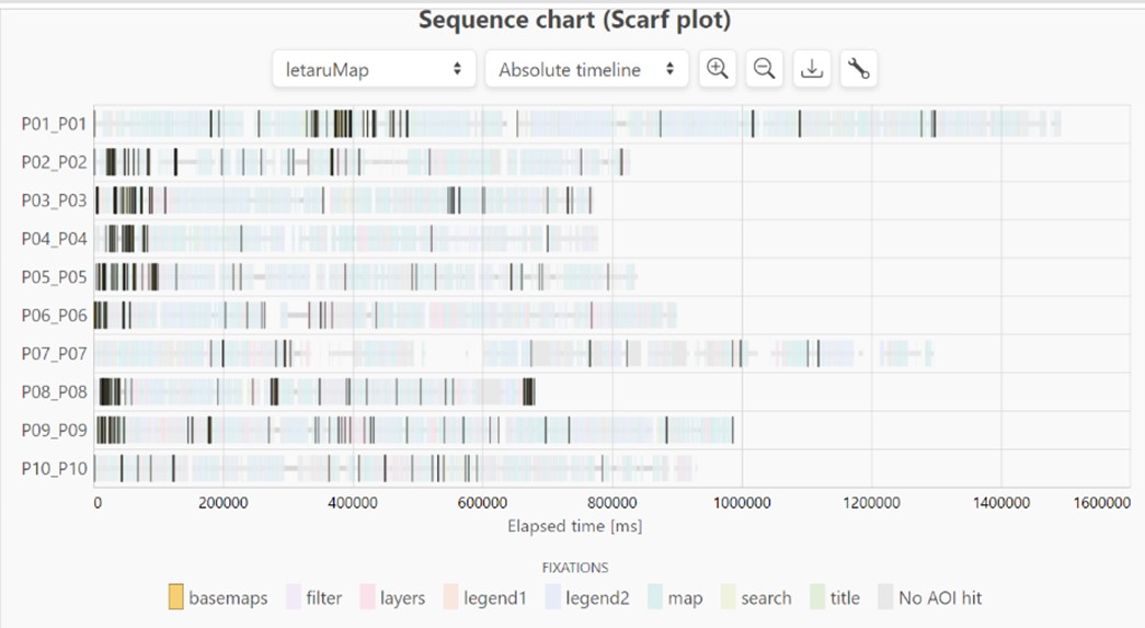
The eye tracking experiment explained why some participants were not able to switch the basemap.
Two scenarios were observed in the sequence chart above. Participant P07 noticed the basemp switcher after completing the task,
and with a short dwell time. On the other hand participant P10 noticed the basemap swither within the taks but did not dwell on it.
This participant did not associate the tool with its intended purpose.
Conclusion

The aim of the thesis was to create a web map depicting the access to electricity utility infrastructure in the informal
settlements of Kampala and to perform the user experience with the developed web map. To achieve this goal,
the thesis was divided into three sub-goals as described below:
The first sub-goal was to develop the electricity utility infrastructure distribution web map for Kampala.
To do this, it was necessary to establish the desired functionality of the web map. This was achieved
by evaluating the existing web maps in the energy sector of Uganda, evaluating engineering drawings from
umeme, and conducting interviews with selected engineers at umeme
The web map was developed with MapBox GL JS, using electricity infrastructure data collected under the
Spotlight Kampala project and available on OSM. The functioning web map with interactivity via pop-ups,
hover effects, filters, and zooming, including the GUI windows and native functionality, was published for
usability assessment.
The second sub-goal was to perform a usability assessment to determine any problems with using the developed web map.
This was done using a mixed approach with both qualitative and quantitative analysis of subjective and
objective feedback. Both the remote and in-person (eye-tracking) usability assessments identified the same
challenges. However, the eye-tracking experiment provided further insights into why some participants were
not able to change the basemap and why the population density legend was problematic to use
In conclusion, a functioning web map was developed using MapBox GL JS, and a usability assessment was performed
using a combination of remote and eye-tracking (in-person) methods. The complementary nature of the selected
usability assessment methods was observed, with both methods able to identify all the problems, but eye-tracking
was able to give further insight into why some problems occurred.