Results
A summary of the results achieved in the previous research.
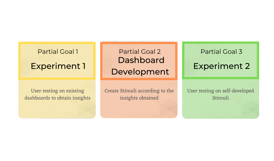
Experiment I
According to what both quantitative and qualitative data results show, the following recommendations are formulated.
A proper dashboard should include light aesthetics with a choropleth map, a country list sidebar with a search option and numeric metrics that interact with the desired requested information (instead of pop-ups). Temporal data should be displayed in graphs and there should be an option to choose a date or period in time; a concise, clear title is necessary, as well as to avoid big blocks of explanatory text.
Dashboard Development
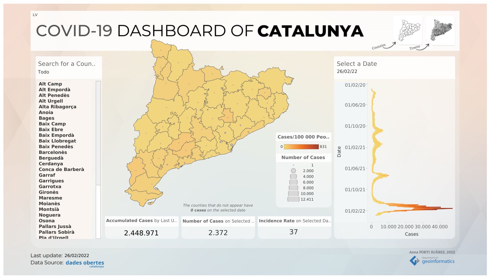
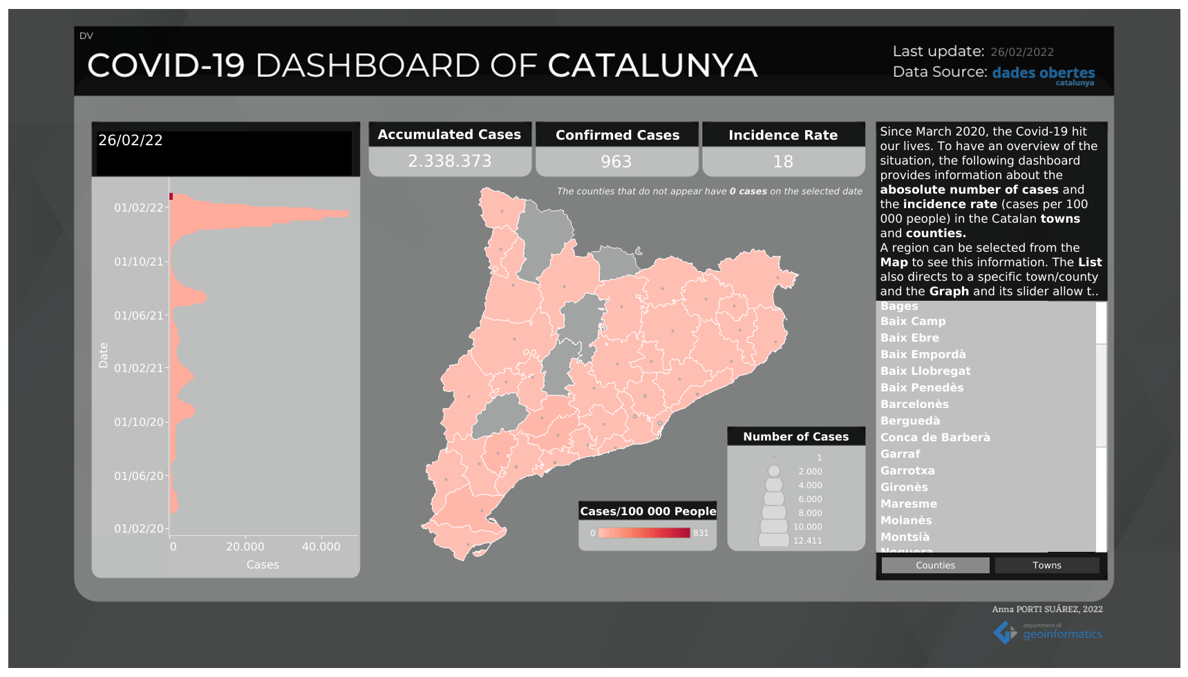
Two dashboards are created: the Light Version (LV) and the Dark Version (DV). They have a different interface appearance but they share some similar elements: both’s map field is a choropleth map showing the incidence rate (cases per 100 000 inhabitants) with quantified symbols displaying the absolute number of cases following the cartographic rules. LV is moreinteractive because of dynamic numeric metrics and a search option, while DV has a block with explanatory text and the date selector is a time-slider.
The technologies’ familiarisation is part of this research. The usage of Tableau Desktop allows interface design, with a possibility of a lot of functionalities to display, but on the other hand it does not allow automatic refresh of the data, which fails to serve the purpose providing up-to date information on the metrics of COVID-19.
Experiment II
The subjective option of the participants confirm that it is easier to interact with the Light Version. The functionalities added allow the time to solve the tasks in average to be lower, as well as the success rate is higher. Results are very similar but bring new insights: the numeric metrics being more noticeable when located in the top of the interface; for the search option, when choosing a date selector, it is preferable in a drop-down in a menu, and typing is the most effective option; and the tabs are likely to be perceived if they are close to the element they refer to.
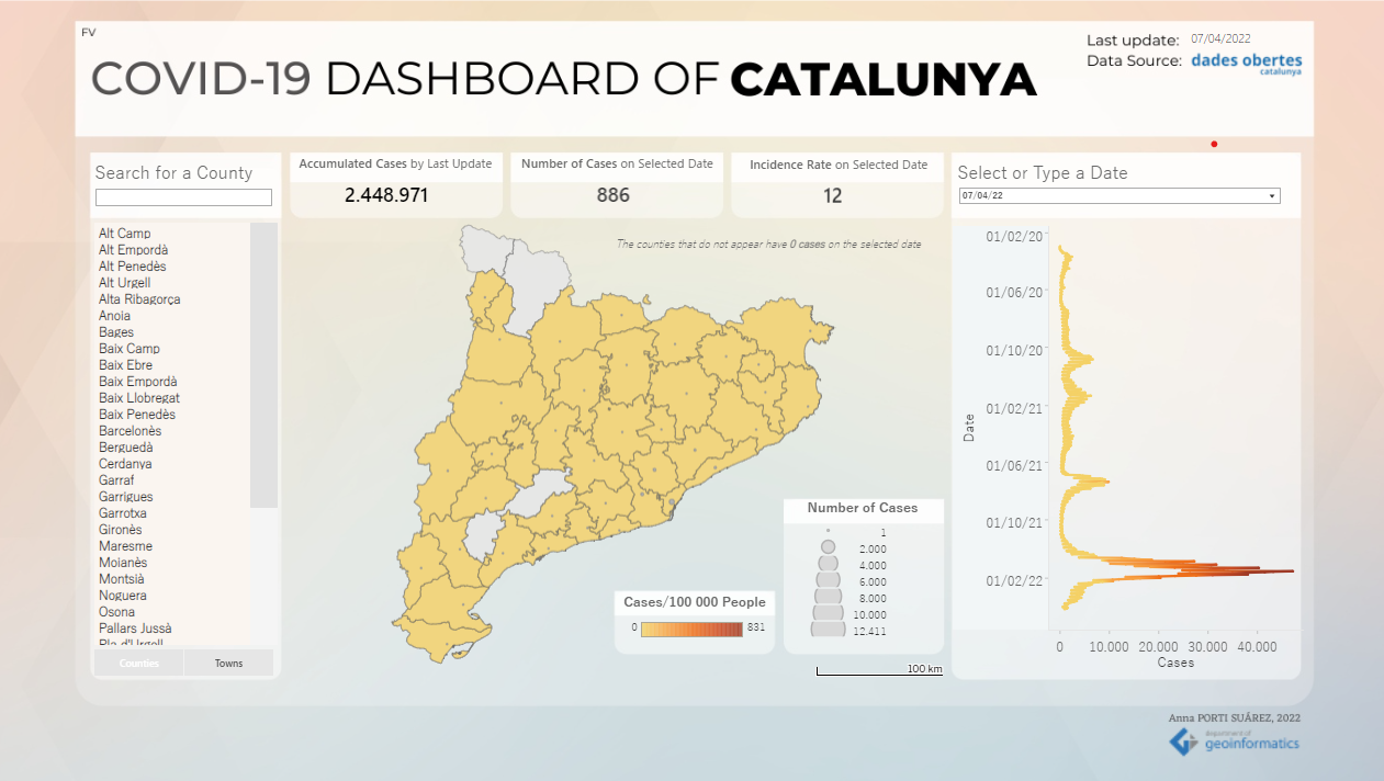
With this, a Final Version of the dashboard is created.
Conclusions
Together with dashboard development tools and functionalities, this work involved the characterisation and familiarisation with analysis methods in cognitive cartography, both quantitative and qualitative, focusing on eye-tracking and all the technologies related. Besides this, it is achieved by obtaining insights for dashboard interface design, considering the recommended elements, the appearance of their functionalities and their role in communicating and transferring the information properly, in order to improve future design implementations.
Explore the content

Introduction
Back to the home page, where the thesis is presented and the documentation and the poster are available for downloading.
Objectives
The aim of the diploma thesis is to perform user evaluation on COVID-19 dashboards. For this, several goals and subgoals are established and described in this section.
Methodology
An overview of employed methods and softwares and how they are integrated in the procedure. A mixed-research methodology for user evaluation and the technologies behind dashboard interfaces.